
Emerge 2018 is Bullseye Glass Co.'s tenth biennial juried exhibition for rising talent in kiln-glass. Three jurors were tasked with reviewing hundreds of entries, selecting a group of finalists, and then selecting seven award winners. After the jury process ended, Bullseye Projects curator Michael Endo sat down with jurors Heidi Schwegler, Diane Wright, and Benedict Heywood to discuss the award winners, the competition, and the landscape of contemporary glass. An edited excerpt of that conversation is published in the catalog Emerge/Evolve 2018: A Showcase of Rising and Evolving Talents in Kiln-Glass.
In part two of four, the jurors conintue the discussion of their approach to the process, offer suggestions for the future, and task future entrants to consider, "why glass?". In addition to Michael Endo and the jurors, Mary Kay Nitchie, Bullseye's Marketing Manager, and Lani McGregor, Director of Bullseye Projects, were present.
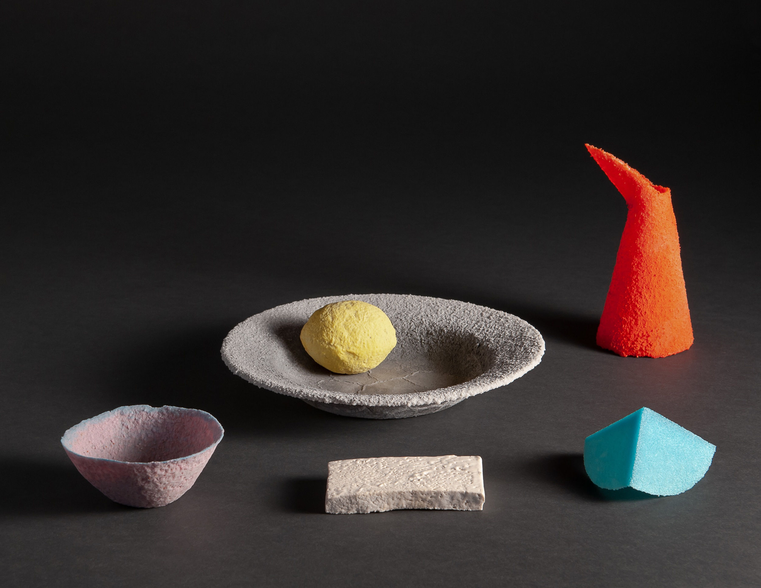
Michael Endo: Saman Kalantari’s Still Life received the Gold Award, what about that work stood out?
Heidi Schwegler: I am struck by how it transcends its materiality. He really exploited the material and it's now down to the thickness of a sheet of paper. So for me it kind of took my breath away because of that; there's a sort of alchemy there.
Diane Wright: I think he really takes this beautiful composition of a still life and reinvents it in a very elegant way. I love the colors that he chooses, the forms that he's using, and the way it's arranged; he was very specific about the arrangement and even the pedestal color. It really is like a painting in the sense that he's chosen the background and then the way it's composed formally. And I think with a work like this you could easily pick it up and set it down in a gallery of paintings in a museum like Toledo [Museum of Art] or another institution and it would hold its place among great paintings.
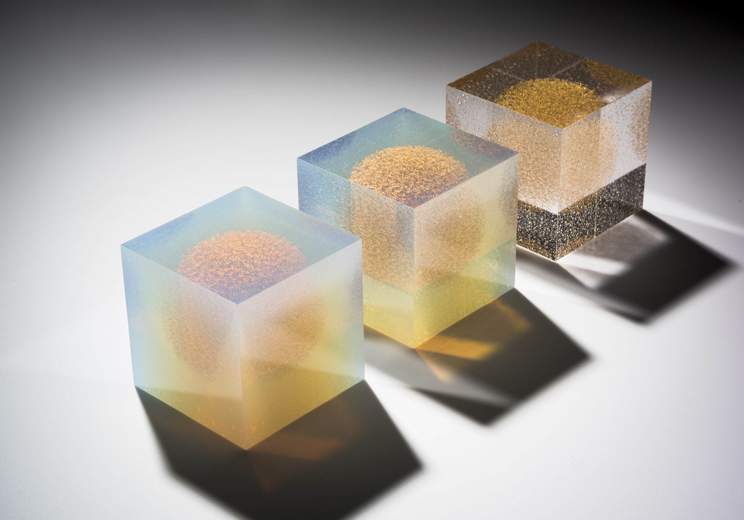
Michael: The Silver Award went to Clare Peters, In Honor of Seeking, In Honor of Knowing, In Honor of Wisdom.
Heidi: If you think of the three categories: the content, the craftsmanship, the design, I think we were all feeling that she excelled in all three, or at least was sensitive to all three. And when you then read her statement, it didn't define the work but it really expanded and made the work even more broad.
Benedict Heywood: She went for the religious aspect and created a series of three mystical objects which have a sense of mystery to them. They have an ambiguity to them which is about seeking knowledge.
Diane: I loved her incorporation of language. The work is beautiful and it's well made, but then you're drawn into it, and you start looking into these little cubes, and you see these incredibly "mystical"–I think is what you said–little balls of gold. And as you look closer you see these letters. And so it starts to make you wonder about what she's trying to say with language and with words, and whether or not there are really any words in there.
Benedict: Yeah, it's hard to see whether there are words or not.
Heidi: It was one of those pieces where we obviously included her in the show from an image, but when you saw the actual object it really came alive.
Diane: It draws you in in a way that makes you begin to think more about the piece, and then want to read more about it, and kind of understand it. Which is exactly what I want a work to do for me. I think her work is a really great example of when an artist is able to visualize what it is that they're saying. And that's a really hard connection to make. Because oftentimes you read the statement and you look at the work, and there's no connection. And so if you could actually create an object that articulates visually what you're saying...
Heidi: ...without illustrating it...
Diane: ...then you've succeeded.
Heidi: Absolutely. And we talked about that yesterday; it felt very complete because of that.
Diane: You understand by looking at it what she's saying, and vice versa.
Michael: This conversation hits on two other topics that I think applicants are continually questioning, one being the importance of artist statements and the other being the disconnect between what we see digitally during the initial jury process and how we experience it in the physical space. Since these came up, would any of you like to give your thoughts?
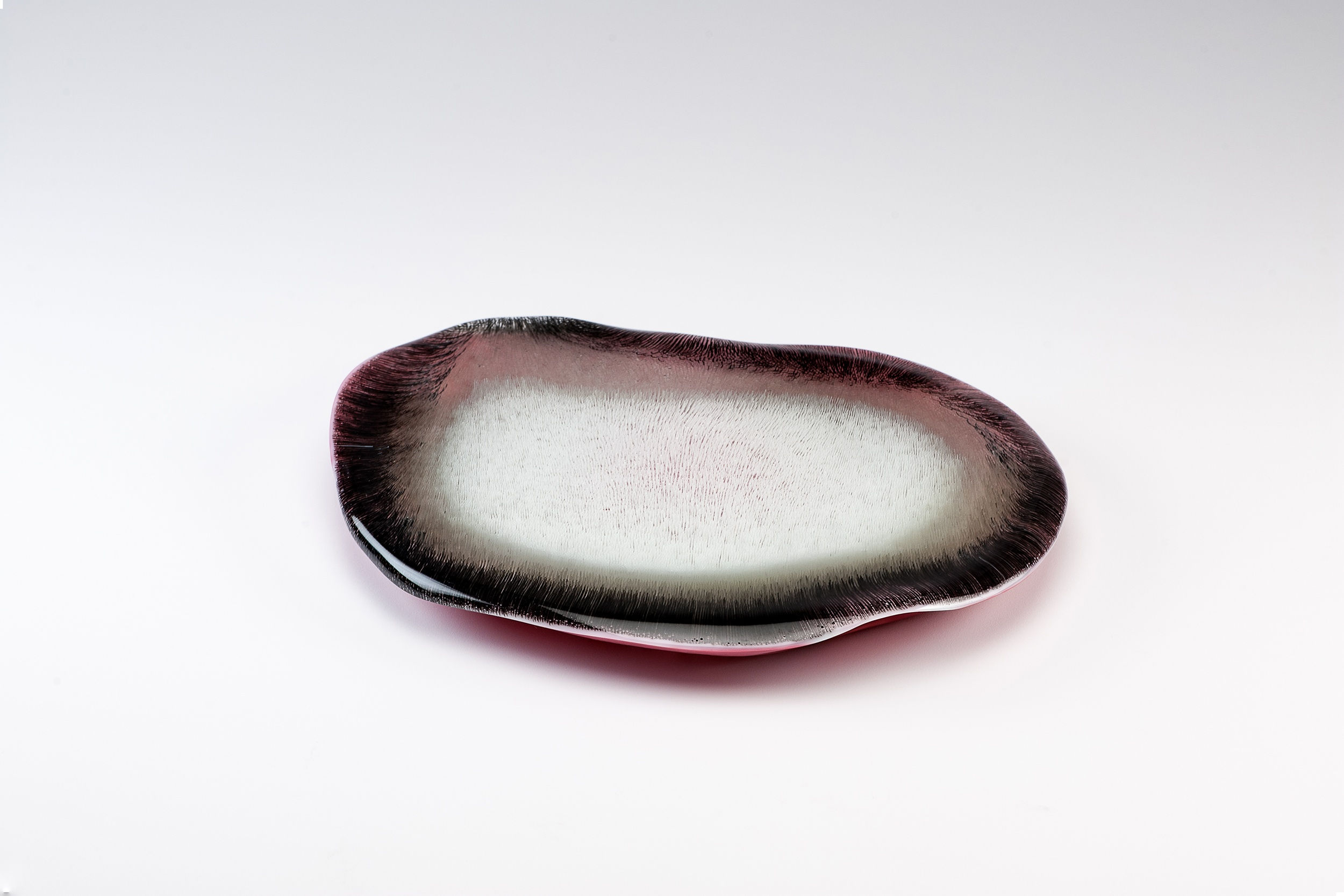
Benedict: Our third place piece, Dagmara Bielecka's Organica I, I think, to me, exemplifies the second topic really well. I was just astounded to see it, because it's an object that is very hard to photograph effectively, which in some ways makes it a very successful work of art.
Heidi: I would like to go back to that moment because it is one of those pieces where it absolutely becomes alive when you get your face right up in there. There is so much nuance and change in form and color that you could never have seen in a photo.
Diane: That is one of the biggest challenges, I think, about this process. There can be things that get away because the artist doesn’t have a good photograph.
Heidi: That's why I'm glad we do the in-person selection process for the awards.
Benedict: I think advice for potential applicants is to photograph your work really, really well, and really invest in doing that. If you want to get through that initial photography phase it has to look like how it's supposed to look, otherwise we're not going to understand it. There's no other way to judge this on an initial pass without looking at a photographic image. Think about what you're doing when you take that picture.
Mary Kay Nitchie: We offer the option to upload a video. Would any of the pieces have benefited from a video?
Diane: Well that's funny, we were talking a little bit about that because there were some people who put their object on a pedestal and then walked around it and filmed it. That can actually show you the object better, but I think that it's important for people to learn how to photograph their work because that's mostly how you have to present it, and that's mostly how people experience work. If your work is in a museum, if your work is in a gallery, most people are going to experience your work through images. And so you have to be able to do that. Some of these could have really benefited from…
Heidi: Details.
Benedict: Details, yeah.
Michael: So here are two instances, Claire Peters’ In Honor of Seeking, In Honor of Knowing, In Honor of Wisdom, and Dagmara Bielecka’s Organica I, where seeing the work in person added to work. Were there any pieces where the image was more effective?
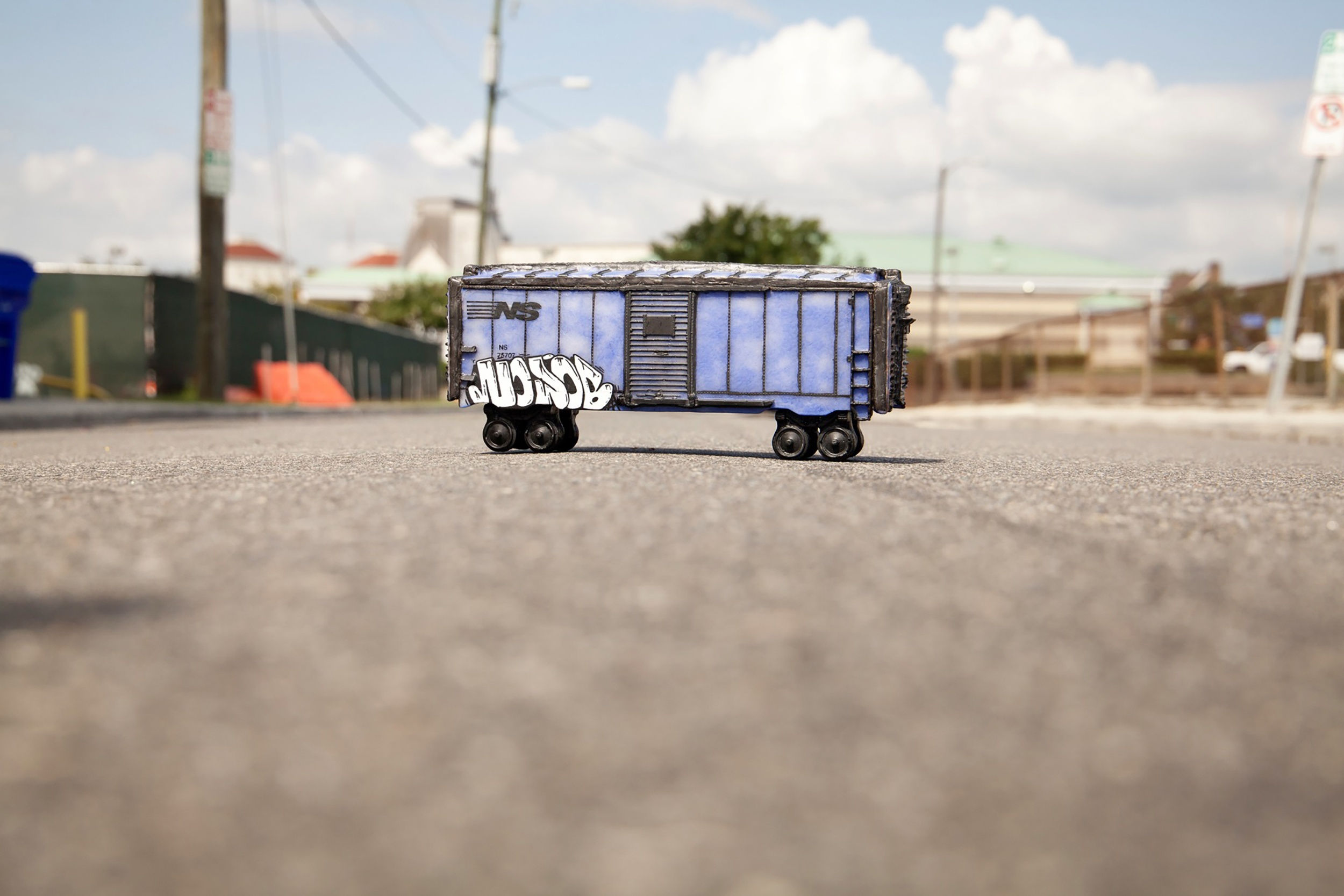
Heidi: Emily B Juel’s NS75707/CONTAINER OF PROSPECT/NOJOB. She photographed it outside. So it was [obvious] that it was a model but it was photographed at a site that added to the content of the piece for me. But then when we saw it in the show, it was just the piece, and I think it limited my experience of it, because there was so much about that site that added meaning to that object.
Diane: Do you think she should have shown a photograph next to the work?
Heidi: I think that she could have played with the presentation. I think this is an overall criticism the show. Many of the artists didn’t seem to consider the presentation of their objects like Saman Kalantari did, which, just because of the color that he laid down, really elevated and added meaning to the objects. I think that if artists really flesh out the presentation of the object, it helps guide us.
Benedict: There were a number of instances where the presentation, to me, seriously let down the piece, and gave us problems in terms of looking at the work effectively.
Michael: Do you think that's the fault of the artist or the exhibition designer?
Heidi: Artist, because I think that every artist should fully consider how their works are presented, even if it's on a white pedestal.
Evelyn Gottschall Baker, who actually is an Honorable Mention because her bones are spectacular, didn’t, I feel, go beyond her desire to represent natural forms. If you just stop there then you're going to present the bones as if they were in a natural history museum. You're going to present it in a way that is expected. For me, presenting the work in sand actually limited our understanding of what it could be.

Michael: How did the sand limit our understanding?
Heidi: I think it limited it because she may have stopped at, “I like to represent nature.” What I'm asking the artist to do is to think about presentation as adding another discourse to the conversation. Allowing one to think in the broader context of why this work exists. Asking, “Am I going present this in a scientific way? Am I going to present it as a sculptural form?" All of that adds content to the work. Saman Kalantari chose a very particular dark color for the pedestal that, I agree with Diane, all of a sudden situated the work within the realm of still life painting. If the work had just been on a white pedestal they would be glass objects on a white pedestal, and it would limit our understanding of it.
Benedict: Again, as Diane was pointing out, the main way that you'll experience any work of art is usually through photography. The other way that you experience any work of art is seeing it in an exhibition context. And that context is really very important. If you just leave it up to us as the curators we'll do the best that we can, but you should think about the instructions you give us.
Heidi: Andy Plummer’s I Moved On Her Like A Bitch could have benefited from a dark background as well. His piece would have been spectacular in a darker context.
Diane: That's a really hard thing to grapple with though, spending so much of your time and energy making this work to then move beyond that and think of the installation.
Heidi: But as an artist, you have to.
Benedict: Yes, you have to.
Diane: So it's really like you have these three really challenging elements, the work, the statement, and the presentation. You have to achieve all three equally. Not everyone is going to read the statement in a gallery or museum setting, but everybody is going to look at the presentation and you can't expect the viewer to make a leap beyond something that might be really distracting.
Heidi: How you present your objects, even subconsciously, is going to add meaning to those objects.
Benedict: Well, we also discussed how the wooden stand on Brennan Kasperzak’s Multi Color Range and Quilt changed the way we looked at it.
Heidi: Altering the presentation would have changed meaning. Here again, I think of the miniature train. In the exhibition it is a little object on a shelf; whereas what I saw in the image was talking about the post-apocalyptic nature of a specific site. It went into other sorts of meaning and significance that in this exhibition is missing.
Diane: That image was really great.
Read more:
Emerge Jury interview (part 1 of 4)
Emerge Jury interview (part 3 of 4)
Emerge Jury interview (part 4 of 4)
An edited version of the interview is included in Emerge/Evolve 2018: A Showcase of Rising and Evolving Talents in Kiln-Glass, available for purchase at bullseyeglass.com.
Emerge/Evolve tours to Chrysler Museum of Art April 5 - July 28, 2019, including An Evening with the Curator: Michael Endo on the Art of Kilnformed Glass on May 30, 2019.
Emerge/Evolve tours to Bellevue Arts Museum August 23, 2019 - January 12, 2020.